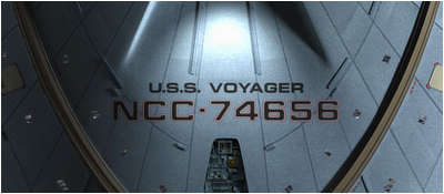
TrekCore VoyWeek: Delta Quadrant – “CG VOY: Rob Bonchune”
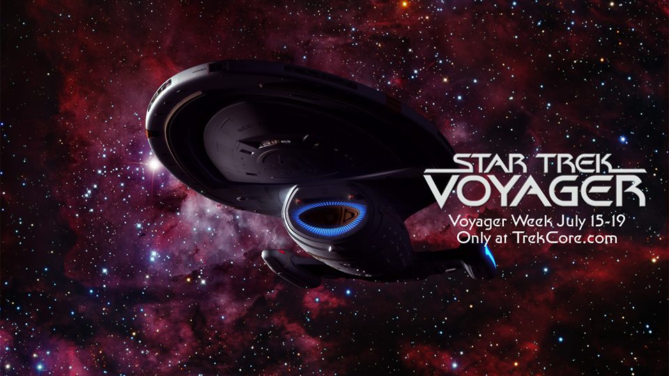
Last week was Voyager week on TrekCore.com. During this week TrekCore was releasing special Star Trek Voyager related content. This was done by their official website: www.TrekCore.com. As a Voyager fan website, we will keep you up-to-date with all these releases. Read here the article about Voyager’s Visual Effects: Creating the CG Voyager with Rob Bonchune.
Source: TrekCore.com
Wrapping up Voyager Week with a very special behind-the-scenes article from former Star Trek: Voyager Senior CG Supervisor Rob Bonchune. Rob’s tenure at the franchise led him to work on all three CG-heavy Trek shows: Deep Space Nine, Voyager and Enterprise, eventually becoming the Senior CG supervisor for the last seven years of the franchise’s television run.
In this new column written exclusively for TrekCore, Rob discusses the history and challenges of creating a CG version of the U.S.S. Voyager.
Column by Rob Bonchune for TrekCore.com
Hello to all you ship fans!
If you’re like me, nothing beats some nice orthographic views of your favorite ships from all the cool sci-fi television shows and movies we love. I came across some CG renders of Voyager in the TrekCore image archives – I spent 5 solid years working on Star Trek: Voyager, even contributing to the practical miniatures for the pilot before moving on to the CG realm – and I felt they were truly unacceptable, and that they didn’t reflect the quality of lighting and textures of the model I used in the show.
CG was coming into play more and more on television shows during the mid-1990’s, as a way to get a faster turnaround for the money spent and to make redoing shots far easier without the high expense of repeating an entire motion control miniature shot.
Although a practical filming miniature of Voyager was built for the show, the producers – especially the VFX Producer that worked with me, Mitch Suskin (and of course Dan Curry) – were planning to move completely towards CG models by the last few years of the series, if the technology proved viable. Two versions of the CG Voyager were scanned from the physical model, and built before the series began – one was built in Lightwave by John Gross, Bruce Hall, and D. H. Jones from Amblin Imaging; the other was created by Santa Barbara Studios using “Dynamation,” their in-house design software.
Dynamation was also used for the Son’a ships in Star Trek: Insurrection – but because of the software’s incompatibility with Lightwave, it was virtually impossible to translate those digital models into a Lightwave-ready format.
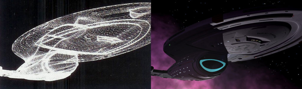
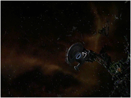
The opening title sequence for Star Trek: Voyager had six distinct segments – three used motion-control shots of the studio model (here, here, and here), and three were made with Amblin Imaging’s Voyager model (here, here, and here). The segments done by Santa Barbara Studios where the ones that had volumetric-type effects, like the smokey nebula which Voyager passes through. At the time, Lightwave did not have these capabilities, although they would be added in a software update a few years later.
Amblin Imaging had access to the physical miniature, and took detailed shots of the model as closely as possible – to use the actual physical model’s surfaces as textures on the Lightwave CG Voyager. It turned out to be a great idea, and for the most part, it worked very well.
I was working for Foundation Imaging when I was finally assigned to Voyager full time, and that’s when I had the chance to examine the existing Voyager CG model we had to use every week. I really wanted to give the CG model a major facelift so being new to the show, I asked Mojo – who was my Supervisor at Foundation Imaging on Voyager – and Mitch Suskin who was his Mojo’s supervisor from Paramount – if, even on my own time, I could implement some changes to more accurately match the filming model as I felt we could not use it as it existed at the time. (This was all new to me back then and little did I know what the future held!). Using both good, clear shots of the physical model, and looking at the maps that Amblin had created, I set about pinpointing the areas that needed most work… and I’m not sure how it happened, but those ship image maps were tinted purple!
Of course, if the ship was lit correctly and not used for close-up shots – which is how it was being utilized at first – you didn’t really notice, but the purist in me couldn’t allow the purple hue to remain in place. According to Rick Sternbach, the Voyager hull was really a “duck egg blue” color, and when you saw the physical model in person it couldn’t be more obvious. I knew that we were probably never going to use the physical model for any additional shots going forward so there was no way a fanatical, nitpicking ship perfectionist like me was going to let that color discrepancy stand. I spent quite a few evenings correcting all of the image map colors to match the physical model’s shade of blue.
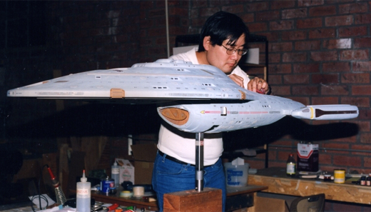
With the time I had, I did my best to change all colors and textures to match the filming miniature as closely as possible. I got most of it done – all the big surfaces and larger details made matching CG shots to stock miniature shots pretty much a non-issue with some basic lighting. Once that was complete, the “new and improved” CG Voyager – approved by the Mitch and Dan – was given to Digital Muse and EdenFX, so that we were all working with the same source.
Maybe I was nuts, or maybe I cared too much, but I know that I wasn’t the only one. Every member of the Star Trek team at Foundation – even as the roster changed over the years – were always the type that would put in the time needed to do their absolute best, and to make something look as good as possible. Considering the late nights and weekends spent in front of monitors, I guess we were crazy – but damn, I couldn’t use a purple Voyager when a few nights worth of work would make it far more realistic!
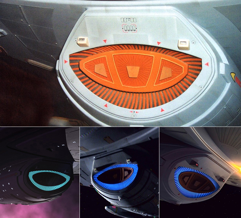
There was one thing I remember changing – one horrid thing that truly did NOT work on the CG Voyager at the time – that was the blue glow behind the deflector dish. It was originally just one luminous surface and one solid color with glow, whereas the physical model had variations in the brightness as angles changed because it was lit through frosted clear resin and had a single light source. I tried my best to reproduce that look using fade maps and other texturing procedures to duplicate the variations, so it wouldn’t stand out as being obviously different.
Later, with Lightwave’s newer materials/texture features, I could REALLY get it identical – but for the time, it was a lot closer, and most people couldn’t tell if what they were looking at was the physical or CG model. A few years later, Lightwave acquired even more surface types – such as translucent surfaces – and I was actually able to truly imitate the real-world look by creating a “frosted glass” material and putting real lighting behind the panels.
Bottom: Early CG in “Unity”, more refined CG in “Thirty Days“
I redid the warp nacelles in the same fashion, and was finally able to add the proper dimensional copper striping that went across the blue nacelle surface. This was really only visible when the warp drive was off, but it was a pleasure to be able to match it to the physical filming miniature exactly.
Throughout the run of the show, we used three separate CG versions of Voyager. We had a very low-resolution, low-polygon “stand-in” model for use in quickly and easily blocking out shots; we usually did this for all the ships we built, since the modelers sometimes needed more than a week to complete a final model – but we couldn’t wait that long to begin doing animatics or blocking out the ships’ motions. On some occasions – totally by accident – the Voyager stand-in was left in the final version of the show for some some distant shots… and nobody caught it! It was mapped with the orthographic images of our “normal” CG model, so from very far away you just couldn’t tell – but it was considerably less heavy in polygons, by a factor of 100!
For almost all the regular CG shots we created, the Voyager I “refitted” was used, but for those close-up, paint-scraping shots where the camera was maybe a few meters above from the hull – like the opening sequence in “Good Shephard” – we had a special up-rezzed Voyager. At first, we built just the section we needed to hold up to the camera’s increased scrutiny, but after a few seasons of having to do many of these types of shots on nearly every part of the ship, we ended up with a much heavier high-resolution model that we could use for any occasions that called for it.
You may wonder why we didn’t just use that high-resolution model all the time, but the memory allocation and processor speeds on the rendering computers were much smaller and slower compared to today’s options, and we were trying to economize on memory usage all the time. The less we used, the more other things we could do – like adding two or three more ships in the shot, or rendering a planet with a high-resolution map. Then the model would render faster, so it was always a bit of win-win when optimizing each scene and model.
So, for my friend Adam at TrekCore – and because I put so much care and time into bringing the CG Voyager up to par with the filming miniature – I hope you enjoy these new new high definition orthographic views of the USS Voyager used throughout the series, rendered EXCLUSIVELY for TrekCore.
Here are just a few of the upgrades I’ve put into the model:
– Added the red brackets around the three docking ports on the saucer that are on the miniature, but were never included on the CG model
– Added more texture detail to certain surfaces, and completely redid the sensor panels with all the nurnies (in terms of color, panel lines, and weathering); they were too dark previously
– Added edges to the corners of all the surfaces within the deflector dish (and other panels across the ship); they were just impossibly-perfect square edges rather than including at least one slim 45 degree bevel for added realism
– Replaced the silly light flares that represented the navigation and running lights with actual “glass” fixtures; no more little fuzzy pom-poms
– Added docking port door paneling details and lighting panels that encircle the doors; cast a very dim light highlighting the doors for realism
– Updated and lightened all the surfaces that were painted too dark, as compared to the filming miniature
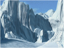
For a lot of the actual shots from the series you see, especially the snow crash in “Timeless”, none of the work could have happened without the help of the amazingly talented people I worked with, was taught by and had fun with! Of course, Ron Thornton – Owner of Foundation Imaging – who took a chance and hired me, John Allardice, Koji Kuramura, Brandon McDougal, Pierre Drolet, Kevin “Q” Quattro, PJ Foley, Chris Zappara, Emile Smith, Kyle Toucher, Lee Stringer, the great and wonderful John Teska, Sean Scott, Sean Jackson, Dave Morton and several guest CG Artists over all those years. I left the most infamous one for last: Mojo, who passed on the torch and taught me quite a bit, both with Lightwave and Hollywood politics!
Readers, let me know what you think!
— Rob Bonchune, Senior CG Supervisor Voyager, Deep Space Nine, Enterprise